Examples of writing
Olla from Gabi
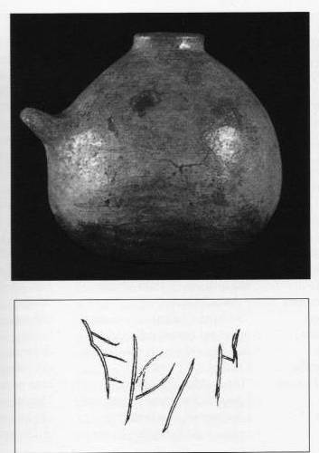
An object discovered relatively recently and of great interest when considering the spread of writing in Lazio, even if not Latin writing, is worth mentioning. This is the graffito discovered on an olla from Gabii (a city in Lazio, east of Rome, along the Via Prenestina), datable – given the archeological context where it was found – to the first quarter of 8th century BC. It is generally read as “EULIN” (in this sense it could refer to skill in weaving, D. Ridgeway), but there are all the same other readings, like “EUOIN” (a Dionysian invocation, E. Peruzzi), or the retrograde and Latin writing NI LUE (G. Colonna). If it was in the Greek language, it would be the oldest evidence and would show how Greek writing was present in the Latin area independently of Etruscan influence.
Praeneste fibula
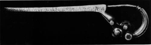
Manios med fhe fhaked Numasioi
Translation: Manio made me for Numerio
The piece may be among the oldest examples of Latin writing. Of fine quality and excellently persevered, it is a buckle (fibula) made of gold with the inscription of the artisan who made it (Manio) and the person it was made for (Numerio). This type of item is called a “speaking object” because what is written is considered to be spoken by the object itself. The writing is retrograde, following the characters of the Archaic alphabet, similar – as we have seen – to the Greek alphabet. All the same, there have been doubts about whether the piece, or even just the writing, are authentic. In particular M. Guarducci wrote to denounce the falsification of the inscription, beginning with the obscure circumstances in which it was found. She identifies W. Helbig, the famous archeologist, eminent scholar of the German Archeological Institute at the end of the 19th century and well-known figure in Rome at the time. The question has not found a unanimously-accepted solution.
Lavinium - Lamina
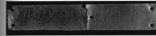
Castorei Podlouqueique qurois
Translation: to Castore and Polluce, kuroi
The inscription, found in Lavinium near Altar VI during the dig conducted by F. Castagnoli in the 1960s, is written on a lead lamina that must have been attached, as can be seen from its five holes. It is a dedication to the sons of Zeus, here defined with the Greek term Kuroi (=youths). The writing is Latin and goes from right to left, with some peculiarities which indicated its Greek derivation and Etruscan mediation. The “L” is similar to the Chalcidian lambda, the “C” to the Chalcidian gamma, but with the sound that it had come to take on in Etruria (/k/). The “R” and the “P” can be distinguished for the greater or lesser closure of their loops. A further indication of its archaic nature is the presence of the koppa (kurois, Podlouqueique).
Lamina (drawing)
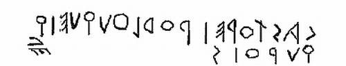
lapis satricanus
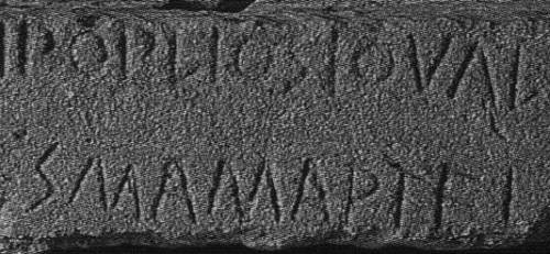
Popliosio Val
s Mamartei
(completa:
[...]iei steterai Popliosio Valesiosio
suodales Mamartei
Translation: [...]the companions of Publius Valerius set this up to Mars)
The inscription, on local stone, dates to the beginning of the 5th century, and is a dedication to Mars on the part of Publio Valerio and his “companions”. At the moment of its discovery, it caused a sensation since it seemed to confirm the real existence of a well-known Roman personality of the time: P. Valerio Poplicola. A leading figure of the first Roman Republic, according to the narration of Livy and that of Dionysus of Halicarnassus he had laws approved that aimed at protecting the people after that he had been accused of affectatio regni after he tried to build his house on the Palatine. (In particular, the Valeri are assocatiated to the lex de provocatione, under which in criminal cases, all citizens had the right to recourse to a judge of the people if the sentence was considered unfair.)
The writing shows an evolution compared to the ones seen above: the M is progressively normalizing towards its final form, the middle line of the A is becoming horizontal, and the short cross lines of the E are less inclined. The R still has a very reduced oblique line, while the P retains its open loop.
Elogium Duili
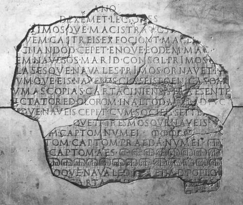
Trascription of the first 7 lines:
[Consol Secest]ano[s socios p(opli) R(omani) Cartaciniensiom]
[opsidione]d exemet lecione[sque Cartaciniensis omnis]
[m]aximosque macistr[a]tos l[uci palam post dies]
[n]ovem castreis exfociont Macel[amque opidom]
[p]ucnandod cepet enque eodem mac[istratud bene]
[r]em navebos marid consol primos c[eset copiasque]
[c]lasesque navales primos ornavet pa[ravetque]
Brief notes:
This famous inscription containing an elogium for the Consul Gaio Duilio was placed at the base of the rostral column erected in his honor after the victory in the Battle of the Aegusa (241 BC) which marked the end of the First Punic War. Besides the great importance of the piece from a historical point of view, it is also of some interest from the more material point of view of the writing. Among these there is the constant use of upright letters, which when combined with the harmonic alternation of the forms of the letters clearly indicates an Imperial date. On the contrary, the language is archaic, and reflects the text as it had been engraved the first time. It is clear that this text comes from a rebuilding of the monument, or at least of the engraved base. Some of the characteristics present in it were very common in monumental writing of the Augustan Age. From the point of view of the writing, these are: the triumph of an elaborate system of binary guidelines with horizontal interlineation, the almost generalized adoption of the mirrored disposition of the lines on each side of a vertical axis, the extensive and conscious use of the gradation of the body of the letters in each line according to the importance of the various parts of the inscription, the use of upright, miniature and superscript letters [from S. Panciera, L’epigrafia latina nel passaggio dalla Repubblica al Principato, in id., Epigrafi, epigrafia, epigrafisti, I, Roma 2006, 83-101, 98].
Vote Elvio!
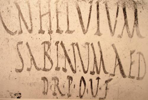
CIL 4, 9928:
Cn(aeum) Helvium
Sabinum aed(ilem)
d(ignum) r(ei) p(ublicae) o(ro) v(os) f(aciatis)
This painted inscription from Pompeii, published by a candidate to the position of aedile, is a good example of rustic capital (so-called from a theoretical comparison with the square or elegant capital). It evokes the monumental capital and maintains its bilinear quality, but with a greater alternation of empty and full lines. Its realization on papyrus/parchment is called book writing, because prevalently used for literary works. The rustic capital remained unchanged in its essential elements for about six hundred years.
Pompeii Tablet
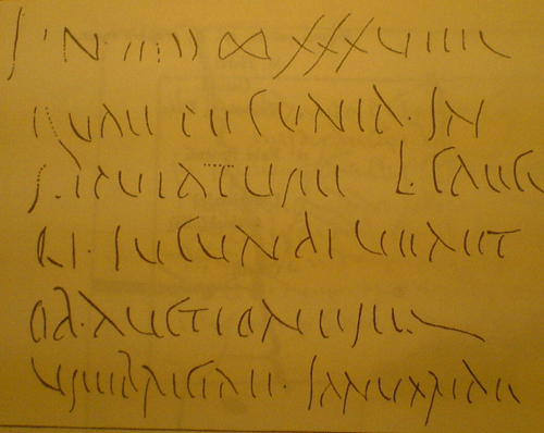
trascrizione:
HS n. ((ι)) ∞ XXXVIIII
quae pecunia in
stipulatum L. Caeci
li Iucundi venit
ob auctionem Umbricae Ianuariae
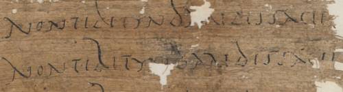
This wax tablet from Pompeii is one of the receipts of payment from the archive of Caecilius Iucundus, and it offers a good example of common writing (equivalent to the French “écriture commune”) as opposed to the monumental for the cursive (in this example it is defined as old cursive or capital). This general definition gathers together some subgroups which were in vogue before that did not represent an exact scientific definition but only indicated one aspect of the writing (e.g., the “actuary). In the waxed tablets the signs are divided into parallel lines and strongly stylized (e.g. E= ||; F= |').
epigraphic cursive
Trascrizione:
L. Seius Pilero(s)
Vener(ia) L(uci) liberta
Seia (h)eres v(iva)
emit duas
ol(l)as sib(i) et patr(ono)
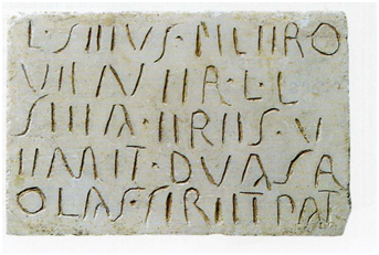
More rarely common writing appears on stone, all the same there are some examples, like this sepulchral inscription, CIL VI, 26115.
PHawara 24
This famous papyrus with writing exercises (the verse is from Virgil’s Aeneid 2: 601 non tibi Tyndaridis facies invisa Lacaenae) offers a good example of common writing, also called cursive capital. In this example, common especially in literary and documentary papyri, not all letters are drawn with parallel lines as in the writing on tablets, but some (especially B, D, E, H, Q e R) take on a cursive form).
fragmentum de bellis Macedonicis
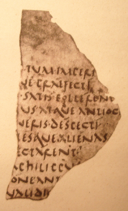
This famous fragment of de bellis Macedonicis, dating from the beginning of 2nd century AD, is of great interest and rarity. It represents the first examples of lower case writing. The famous paleographer B. Bischoff described this writing: “Example of fully developed and formed writing, carried out at an angle of about 50°. Among its letters (the B is missing), the A is smaller, the D has a large loop, the h a corner, the M with three lines and the Q with a narrow head and cauda long and oblique clearly have their origin in the consolidation of analogous cursive forms…. The E (still narrow), the L and the P are a little rounded at the base, the form of the R, instead, with the long vertical line and the right section closed at the first part, as in the capital, is not taken from the cursive, but wilfully used to avoid possible confusion with other letters” (from: B. Bischoff, Paleografia latina, Padova 1992, p. 94).
PChesterBetty
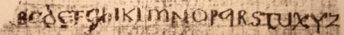
The uncial, of which this image shows an alphabetary (PChesterBetty 1449), is named in this way because Mabillon took the expression from S. Jerome, “unciales litterae”, misunderstanding Jerome’s reference to capital Roman writing. The place of origin of this writing is uncertain (Italy? Africa?), and the earliest examples are from the 4th century. It may be considered a capital letter since the letters can be written between two parallel lines. The angle of writing is about 50°. It has been suggested that some forms come from the model of the Greek biblical capital letter. The most characteristic letter is perhaps the M, called double arch, even if in the first periods the initial line was perfectly straight and not curved. The B perhaps evokes the capital model, while the Q has a straight vertical line, and the E is rounded.
Vatican Livy
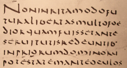
non inrita modo fu
tura libertas multo foe
dior quam fuisset ante
servitutis redeuntib(us)
in priorum dominoru(m)
potestatem ante oculos
Translation: “not only would freedom have been much worse than slavery had been when they returned to serve their former masters” [Livy 34,36,6; NB that the translation is based on the correction of servitus for servitutis and the addition of sed between multo and foedior]
The Latin Vatican Codex 10696 offers an very good example of uncial, for which the important elements are outlined in the description above.
POxy 668
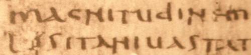
In this particular taken from POxy 668, epitome of Livy (here we can read magnitudinem/Lusitani vastat), an example of semi uncial writing can be seen. This is a lowercase writing, written both vertically and inclining to the right. The following characteristics can be noted (from B. Bischoff, Paleografia Latina, 102): the system is quadrilinear, the left side of the A is an acute angle, the D finishes with the vertical line touching the line of writing, the L often ends below the line of writing, the upper line of the R is bent like a stair, the S is uppercase, the vertical line of the T is straight, the B has its loop on the right. The angle of writing, differently from the uncial, reaches its greatest width in its vertical lines, in correspondence with what happens in the Greek Biblical uncial.
Sulpicius Severus
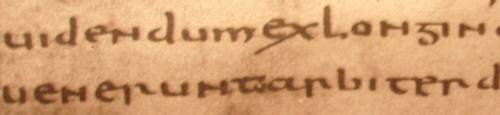
This particular is a re-writing of Sulpicius Severus, copied in new semi uncial by Ursicinus, lector of the Verona church (CLA 4, 494, 517 AD). The writing is new semi uncial, which derives from the new, evolved cursive. From the 4th century it became book writing and it continued until the late Medieval period. The letters are separated. Compared to the old semi uncial, the A is rounder, the G has a perfectly horizontal upper line (see the first line, third letter from right in the following image) and the lower curved like S, the T has a curved vertical line, the N follows the capital model.
Imperial rewriting
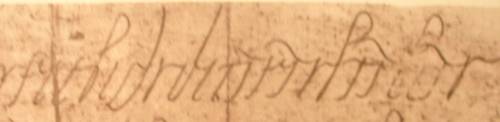
This imperial rewriting from the 5th century shows the evolution of cursive writing. The transformation consists in the passage from capital (or old) cursive to lowercase (or new) cursive, in the 3rd century AD approximately. The difference can be seen in the progressive loss of the bilinear reticule in which the letters are written in favor of a quadrilinear one. In the new cursive there are a number of ligatures, while there are few contrasts in the outline for the use of a hard-pointed quill. This writing is used in particular in the Imperial Chancelleries, like the document offered in image here.
Acquoria Cippus
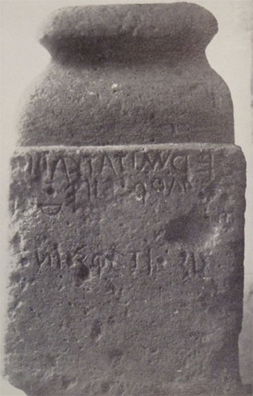
Source: Fonte
The block bearing the inscription was found near the Acquoria Bridge in Tivoli: hence the name of Acquoria Cippus. The inscription, dating back to the 6th century BC (with alternative datations down to the 5th century BC), has not yet found an univocal intepretation (A. Degrassi ILLRP doubted its being Latin more than Sabin). It seems reasonably certain, however, that the writing runs spirally starting from the right side (the first four letters upright being followed by the first line, running backward).
Henceforth some of the attempt to read the inscription:
1) hon/-edmitatka-iọṣ[a]k/oniosϕetiosd[o]ṇoṃdr-ẹipe/d (E. Vetter, Handbuch der italische Dialekte, I, Heidelberg 1953, 357)
2) hoimedmitatkauios[- -]oniosqetiosd[o]ṇọm - - fileod(da ultimo G. Meiser, Historische Laut- und Formenlehre der lateinischen Sprache, Darmstadt 1998, 4)
3) HOI|M|ED|MITAT|KAVIO|S|///|ONIOS|QETIOS|D///NO|M|PRO|FILEO|D (M. Hartmann, Die frühlateinischen Inschriften und ihre Datierung, München 2005, 132)
According to the second and third proposal, an offer made by a Caius for his son should be the object.
As to the form of the letters, note the E with three almost horizontal strokes, as well as the stroke of the A. The S, rather open, has four bars.